Table of Contents Plus + Dynamic To Top Plugins = User-Friendly Long Posts & Improved SEO!
Long posts seemed destined to be my problem children forever! Photography tutorials, comprehensive gear reviews, and step-by-step, behind-the-scenes technical write-ups about photo shoots are all examples of blog posts which don’t lend themselves to short posts. TOC + is the answer….
Click Any Contents Heading To Jump There:
TOC Plus Solution for Long Problem Children Posts
We all need a solution for those posts which turn out to be long problem children posts.This is especially true if, like me, your entire life you’ve been known as verbose and never at a loss for words! Seriously though, there are some things about which there just isn’t a way to write a short post, at least not and do the topic justice. The only answer for such long posts is a great Table of Contents such as the one above.
Long Post = High Bounce Rate & Low Time on Page
Here is why a Table of Contents is important. The problem is, anyone who’s ever actually looked at their site analytics knows that long posts often have a high bounce rate (readers exit the site from that page) and a surprisingly low amount of time spent on the page; certainly far less time than would be required to have actually read the post. It seems that when the average reader sees a long post, they become overwhelmed and either they decide not to read it, or like me, they may bookmark it, truly meaning to read it later, but then never get around to it.
SEO is Affected by Bounce Rate & Time on Page
It’s not just a problem that one user might not bother to read your long post. The problem is magnified because your site’s SEO (Search Engine Optimization) is adversely affected by high bounce rates and low time spent on pages. A low SEO score means readers searching for various topics are not as likely to come across your posts; since your SEO rating is low, your posts are not among the top search engine hits. I wanted a solution for this, which would provide a way for readers to easily see right up front a teaser with a breakdown of all the subtopics in the post. This would increase my readers’ incentive to actually read my content, boosting my SEO scores.
Headings and a Table of Contents for Long Posts
It became clear to me that this was going to be very important for a new post I’m currently writing which is a very comprehensive review of an adventure photography gear product. Up to now, my solution to make longer posts more manageable was to break the post down with headings, so at least the reader can see the information separated into subtopics as they scroll through. I knew this wasn’t good enough though, because my time on page was still low and my bounce rate was still high. I’m really excited about this upcoming gear review, so I decided to manually create a table of contents near the top of the post, giving readers a sneak preview which would hook them in and entice them to keep reading. Seemed a good solution, but I couldn’t stop thinking how much I’d really love it if clicking on any part of the contents would act as a link to take the reader straight to that particular part of the post. It occurred to me that I’ve seen this feature on many websites.
Searching for a Table of Contents Plug-In
I can’t believe I didn’t think of the solution sooner. DUH! There’s a plug-in for just about anything on earth you could want to do with your WordPress blog! I’m guessing this is likely true for other blog platforms as well. Off I went to the “Add New Plug-In” search feature in my WP blog admin panel. There are actually quite a few table of contents plug-ins available. Following the advice of my web developer and coding guru, Tom, I screened them according to how many people have downloaded them and how highly they are rated on a system of one to five stars. Once I’d narrow the selection down by those criteria, I screened further for a plugin that has been tested for compatibility with my version of WordPress. From there, I selected one with features which stood out to me: Table of Contents Plus by Michael Tran.
Why I Chose Table of Contents Plus
-
Auto-Insertion of Table of Contents
The first reason I selected Table of Contents Plus is that it automatically inserts a table of contents into any blog post containing more than a given user-specified number of headings. The user may specify any minimum number from 3-10 headings. Unlike other contents plug-ins, you don’t even have to manually insert the usual bracketed [TOC] code into the post; you merely need to include within the post at least the minimum number of headings you have specified in your TOC Plus settings.
-
Allows Location Near Top but After Introduction
The second feature I really like about TOC Plus is that this plug-in allows you to decide just how far down the post the table of contents appears, by selecting how much you write before the first heading. Most other plug-ins I saw automatically place the contents at the top, which doesn’t allow the inclusion of any introductory lead-in before the table of contents appears. In TOC Plus, you have the option to place the table at the top, the bottom, or before the first heading.
-
Creates Contents for Posts, Pages, and Site Map
Through the settings, the user may elect to whether to create tables of contents for posts, for pages, or both. Thus far I’ve only enabled the feature for my posts, since I haven’t had time to revise all my pages with appropriately designed headings to be ready for contents. The plugin also allows the creation of a Site Map listing all of the blog’s pages and post categories. This is an exciting feature I look forward to creating. While I know that all major search engines create site maps of your blog every time you resubmit your site for SEO scoring (which you should do at least monthly), what that doesn’t do is create a site map which readers can actually see on your site. That is a nice feature when your blog gets more and more complex with a wider variety of categories for your posts. However, for now, thus far I’ve gotten as far as enabling the feature to automatically insert a Table of Contents for all of my blog posts which have at least 3 headings.
-
Settings to Customize Your Table of Contents
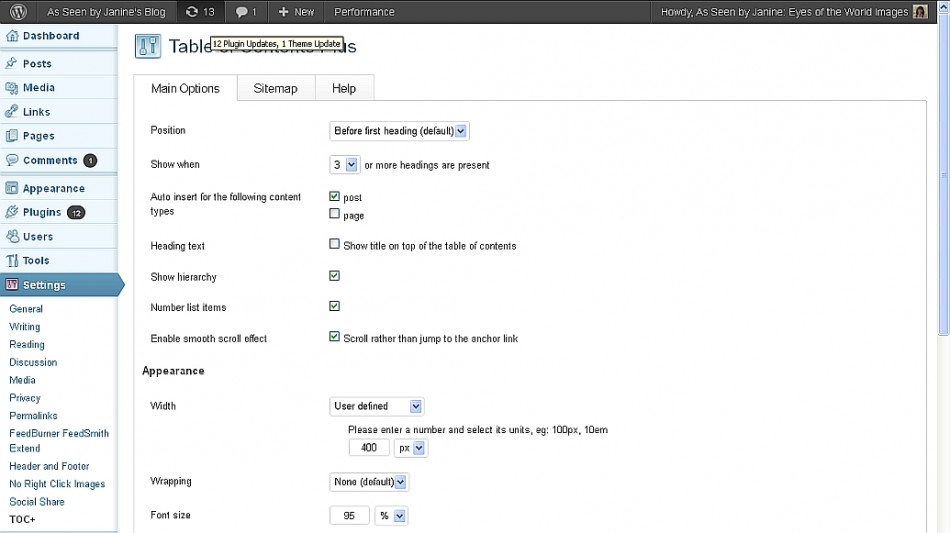
TOC Plus also includes quite a number of ways to customize the format and appearance of your contents. The main options let you control position, whether or not the table has a “Contents” title, whether to show a hierarchy of headings (H2, H3, H4, etc.), whether to include section numbers in the contents, and whether to use a smooth scroll effect or jump to the anchor link. I will note that I discovered a bug with the “jump” option; the jump takes you exactly one line below the heading, so the reader can’t see the heading itself once they jump. For this reason, I chose the smooth scroll option, which truly is smooth and, more importantly, stops with the heading as the top line of the visible screen.
The user can also control appearance by setting the width of the table in pixels, either by choosing from a list of presets, or by creating a user-defined width. I decided to make my table only as wide as would allow my headings to fit on one line within contents. While there is an option to wrap text, I think the Contents look better if each item fits on one line. Text size can also be specified. Below is a screen capture of all the settings just mentioned:
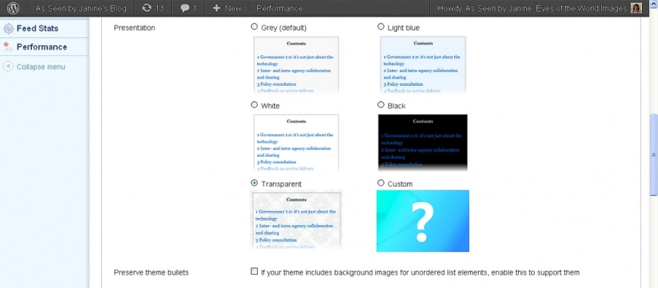
Additionally, the user can control the presentation color options for the background of the table. The choices are: grey, light blue, white, black, transparent, or custom (user defined). I wanted black, but since my blog’s background is already black, I merely selected transparent. Here is a screen capture of the presentation control options:
- TOC Plus Table Presentation Color Options
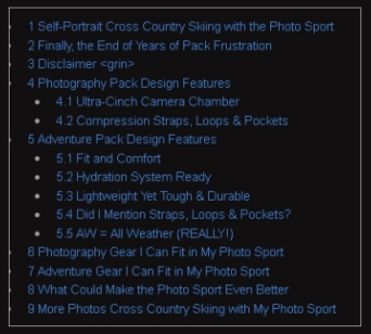
There is also an option to preserve theme bullets within your table of contents. I had started by enabling this since I sometimes bullet smaller sub-headings withing my text (such as H3, H4) in order to make them stand out better. However, I encountered a small bug in the plugin when enabling the bullets to appear in the contents. The problem was that it created bullets for all headings, not just those headings for which I’d manually entered bullets within the text. That might be okay except that the bullets which I hadn’t manually created, but were by default created by the TOC plugin, appeared to the far left actually under the border line of the table. For this reason, I opted not to enable bullets in the contents; the bullets still show by any bulleted headings within the text itself, but not in the TOC. Otherwise it looks weird:
It is likely that this problem occurred because I was using both bullets and heading numbers. I’m betting you can avoid this problem by manually setting bullets before every level of heading (including the highest level) and not checking “Number list items.” I’m guessing this would give a hierarchically indented bulleted list which does not show the top level bullets hidden under the table border. However, I decided I really like the heading and subheading numbering system instead.
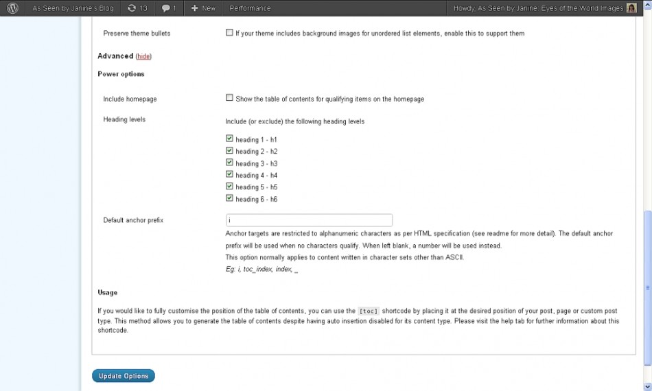
There are advanced settings customization options and a very important one for me was enabling Homepage table of contents. This is vital for me since my homepage, for the most part, is my most recent blog post. Without this option enabled, the reader won’t see the TOC if reading the post from the homepage; only if they click the title link. Other options include: specifying what heading levels to include or exclude; setting a default alphanumeric anchor target prefex; and last, the option to manually control having the TOC appear anywhere in the post by inserting the bracketed [TOC] code anywhere you want. This means the Contents can appear even in a location which you don’t have specified as an included heading type. I am not using this feature because the automatic insertion at a specified heading level is the main reason I chose the TOC Plus plugin. If you do use this option, note that the toc inside the brackets needs to be in lower case not caps. I didn’t show it that way because I don’t want my Contents to actually appear here! Here is a screen shot of the advanced settings:
After playing around with the TOC Plus settings, I was super excited! It is a beautiful thing for readers to see a table of contents early on in a post, giving them a preview of what they can learn if they read it. They can go straight to sections which interest them the most by simply clicking that item in the contents and smoothly scrolling there.
TOC Plus + Dynamic To Top Button = CONTROL
As I began playing with the table of contents and especially the scrolling feature, I found myself wanting a way to easily get back to the top to click another section of the contents. Readers may often wish to read your article in a different order than presented, based upon their interests. Back off to the “Add New Plugin” search feature in WP and I went through several possible “back to top” plugins. Again, I looked at number of downloads and star ratings, as well as testing for compatibility with my version of WordPress. I also wanted a button which would be large enough to be noticeable, but small enough not to cover much sidebar content. I ended up choosing Dynamic To Top v. 3.1.8 by Matt Varone. It is dynamic because the button is not there when the reader is at the top of the page; it only appears when needed, which is as soon as the reader scrolls down the page at all. Then, once clicked to go back to the top, the button disappears again. I find it really handy to keep going back up to refer to the table of contents again and select another subtopic of interest.
Redux of an Older Long Post Adding Contents
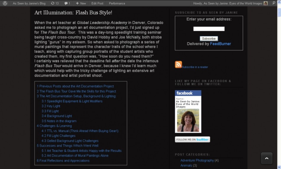
One of the longest and most elaborate posts I ever wrote was Art Illumination: Flash Bus Style! which gave behind-the-scenes specifics on my lighting setups for an extensive art documentation project. I was eager to see this post made more manageable with my new TOC Plus plugin, so it was the first post I tackled revising to insert a hierarchy of headings. I am very pleased with the result, which can be seen in this screenshot of the Table of Contents and you also see the Dynamic To Top button at the bottom right of the page. Better still, visit the post using the title link and play around with the Contents, Smooth Scrolling and To Top features!
Sneak Preview of Lowepro Photo Sport Pack Review
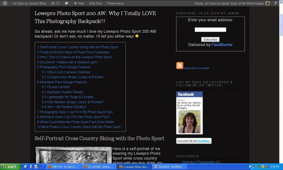
In case you didn’t notice it in the screen shot illustrating the bug with enabling bullets in the contents, that screen shot was a partially developed TOC for my upcoming gear review. Stay tuned because that review is coming soon and, meanwhile, here is a screenshot of the completed (I think!) Table of Contents for the upcoming post: Lowepro Photo Sport 200 AW: Why I Totally LOVE This Photography Backpack!!!
Stay tuned for this review of a fantastic adventure photography pack!
As Seen by Janine: Eyes of the World Images














Pingback: Dragon NaturallySpeaking: Photo Bloggers Save Your Hands for Editing Photographs! | As Seen by Janine's Blog